AI disclosure label.
The EU AI Act transparency icon, used exactly as the European Commission publishes it — not redrawn. For the specific content types Article 50 requires to be marked: deepfakes, and AI-generated public-interest text without human review.
EU AI Act — Article 50, in force since 2 August 2026
This component uses the official EU icon set — freely usable without attribution — so every Aceve surface shows the same mark regulators and users are told to expect.
Using the icons is optional. Complying with Article 50 is not.
The icons support compliance; they do not establish it. Whoever deploys the AI system remains responsible for meeting Article 50 regardless of which mark is used. See also the Code of Practice on marking and labelling of AI-generated content and the AI Act Service Desk.
What this means for Aceve
A scheduling suggestion in Ordrestyring, an AI-drafted case summary a craftsman reviews before sending, a smart default in a form — none of these are covered by the labelling obligation. Labelling them anyway isn't "playing it safe": it trains people to ignore the icon, which is the opposite of what the law is for.
Article 50(4) requires disclosure for exactly two kinds of content:
- Deepfakes. AI-generated or manipulated image, audio or video that resembles a real person, object, place, entity or event, and would falsely appear authentic.
- AI-generated or AI-manipulated text published to inform the public on a matter of public interest — where no human reviewed it and no person or legal entity took editorial responsibility.
Three exceptions
- Artistic, creative, satirical or fictional works. If a deepfake is part of an evidently creative work, disclosure is limited to a manner that doesn't hamper the display or enjoyment of the work.
- Authorised by law. Doesn't apply where use is authorised to detect, prevent, investigate or prosecute criminal offences.
- Human review of text. Doesn't apply where AI-generated text has gone through human review or editorial control and a person or legal entity holds editorial responsibility for publishing it. For Aceve, this is usually the relevant one — if a named human signs off on the copy, the obligation falls away.
Decision check
- Is it image, audio or video that could pass as real? → Deepfake path. Label it.
- Is it text published to the public on a matter of public interest, unreviewed by a human? → Label it.
- Anything else → no label required. If you still want to be transparent about AI involvement, use the patterns on AI patterns instead — not this component.
Unsure? Don't guess. Ask Legal before shipping. Article 99 penalties for transparency breaches run to €15,000,000 or 3% of total worldwide annual turnover, whichever is higher — confirm the current figure with Legal, and treat this page as design guidance, not legal advice.
Variants
Pick the one that matches how the content was actually made. Each official asset bakes in its own text — never add a second label next to it.

 basic
basic
 generated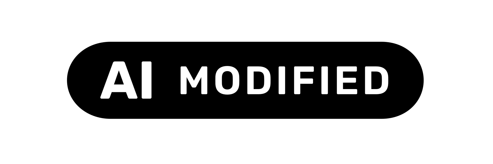
 modified
basicBasicGeneral AI involvement — e.g. a deepfake, or AI-assisted content short of full generation.generatedFully AI-GeneratedEntirely AI-created content, with no human authorship of the underlying work.modifiedPartially AI-ModifiedHuman-made content that was substantively altered using AI.Download the icon set
12 icons — 3 variants × 4 tones (black, white, black-50, white-50). The official EU Commission assets, unchanged.
SVGs are vector and scale to any size without quality loss — use these in Figma, in code, or wherever you need them at a specific size. PNGs are exported at 2× resolution from the same source files.
From the European Commission's official icon set — freely usable without attribution.
Colour variations
The official set ships in four tones. "auto" switches between black and white based on the site theme.


Minimum size
24px, enforced in code. Smaller values are clamped, not honoured.
Both the mark and the optional caption are rendered text, which is the same reason they inherit the 4.5:1 images-of-text contrast bar rather than the 3:1 non-text one. Size follows from the same fact: the caption renders at 54% of size, so a 20px label puts words on screen at under 11px. On a phone held at arm's length on a site in daylight — the condition most of our users read it in — that is not a disclosure, it is decoration.
size=24 · caption 13.0pxsize=28 · caption 15.1pxsize=32 · caption 17.3px- 24px is the floor for any label that carries a caption. Below that the component clamps and warns in development — passing a smaller value changes nothing except the warning in your console.
- Prefer 28px as the working default where the layout allows it. 24px is the point where the caption is still readable, not the point where it is comfortable.
- If the label does not fit, change the layout — not the label. Move it out of a dense toolbar, drop it below the media instead of over it, or use the icon on its own with the caption as adjacent body text at your normal type size.
- Never scale the label with a CSS transform to get under the floor. The clamp only governs the
sizeprop; ascale()on an ancestor defeats it and reintroduces the exact problem.
The rule for the 50% variants
Default to solid. The transparent variants are opt-in and need evidence.
The Commission publishes the semi-transparent icons but sets no usage rules for them. What it does require is that the icon be clearly perceivable and distinguishable at first exposure. Halving the opacity halves your contrast headroom — a black-50 icon on a mid-grey photograph will often fail outright, and a failed label is a failed disclosure.
So at Aceve:
- Use black-50 or white-50 only when a solid icon would cover content the user needs to see — a face, a defect in a site photo, a measurement in a drawing.
- Measure the contrast before you ship it. Sample the actual background behind the icon, not a representative one. These assets contain rendered text, so hold them to 4.5:1 — the images-of-text threshold — not the 3:1 non-text minimum.
- If you can't hit 4.5:1 across the whole area the icon sits on, you have two better options than a transparent icon: move the icon to a calmer part of the frame, or place a solid icon on a contrast plate.
- Never use a transparent variant to make a disclosure less noticeable. If a label feels too loud for the design, the design needs to change — not the label. Deliberately downplaying a required disclosure is the exact failure mode enforcement looks for.
- Never use black-50 on dark surfaces or white-50 on light ones. There is no scenario where that's the right call.
- Never re-create the transparency yourself with CSS opacity on a solid asset. Use the official 50% file so the mark stays identical to the published set.
Rule of thumb: if you're reaching for a transparent variant because the solid one "looks heavy", use the solid one. If you're reaching for it because the solid one hides something the user needs, that's the legitimate case — and it still has to pass contrast.
Plain-language caption
Add a label prop to render a short caption beside the icon. Most needed with variant="basic" where the icon alone gives no context about what kind of AI was used.
Image generated with AIKeep caption text plain — "Voice generated with AI", "Image generated with AI". Avoid jargon like "LLM-generated" or "synthetic media".
Overlay placement
When embedding into the file itself isn't feasible, use the overlay pattern — the label should still travel with the content when it's exported or downloaded.
Real-world examples

Generated image — white AI GENERATED badge bottom-right, plain-language caption below the icon.

AI-generated voiceover — small white AI badge top-right, "Voice generated with AI" caption beside it.
Accessibility
A real <img>, not a background image — so it has a name assistive tech can read.
altDefaults to the variant's plain-language text — "AI", "AI-generated", "AI-modified". Override only if the surrounding sentence already says it.No separate labelThe official asset bakes its own text into the graphic at a fixed aspect ratio — never crop it to a square or pair it with a second, different-looking label.ContrastBlack and white tones ship at full contrast. The 50% tones require a contrast check against the actual background — hold them to 4.5:1 (images-of-text threshold).Props (React)
type AiDisclosureLabelProps = {
  variant?: "basic" | "generated" | "modified";
  placement?: "inline" | "overlay";

  /**
   * Official EU colour variation.
   * "auto" resolves to black on light surfaces, white on dark.
   * The 50% tones are opt-in — see "Colour variations".
   * Default: "auto" for inline, "white" for overlay.
   */
  tone?: "auto" | "black" | "white" | "black-50" | "white-50";

  /** Optional plain-language caption rendered beside the icon.
   *  Encouraged with variant="basic". Must avoid jargon. */
  label?: string;

  alt?: string;   // overrides the default plain-language alt text
  size?: number;  // icon height in px — default 24, also the enforced minimum;
                  // smaller values are clamped. Width follows the official aspect ratio
};